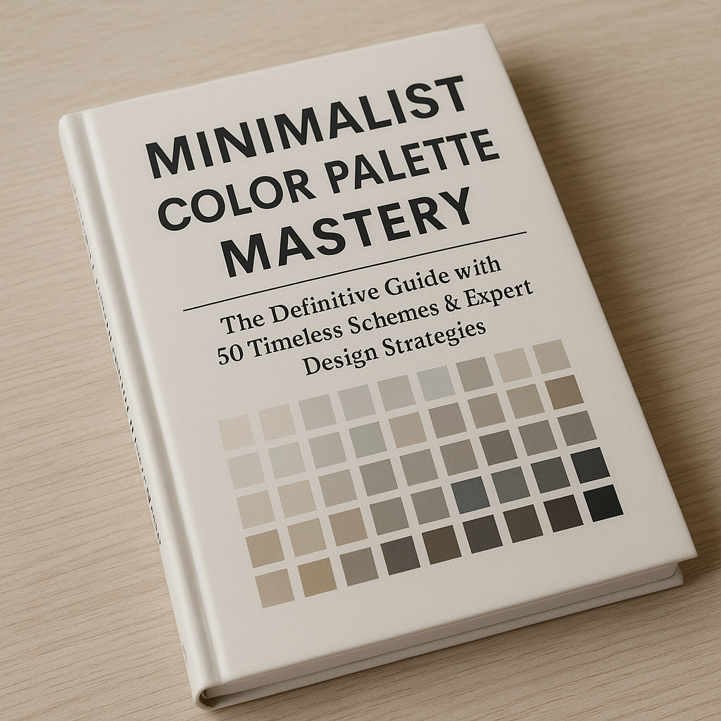
Picture the last app you downloaded, the most recent homepage you visited, or even the thermostat interface you touched this morning. Chances are the design felt calm, airy, maybe even a little luxurious—yet you probably can’t recall more than two or three colors. That sense of effortless clarity is born from the minimalist color palette, and it is no accident. In this definitive, hands-on guide we’ll walk through the psychology, rules, and 50 timeless schemes that make minimalism both powerful and profitable. We’ll also show you how HVAC Marketing Xperts (HMX) leverages these palettes to build high-converting HVAC websites, dominate local SEO, and turn color theory into cold, hard revenue for contractors.
Before We Paint: Why Care About a Minimalist Color Palette?
The digital battlefield is noisy. Billboards, banner ads, inbox promos, Reels, Shorts, Stories: all day, every day, your ideal customer is bombarded by color and motion. A minimalist color palette slices through the chaos like a scalpel—stripping away distraction, sharpening focus on your message, and leaving room for your brand voice to breathe. Three key advantages stand out:
- Faster comprehension. Fewer hues mean the eye parses information in milliseconds. That reduces cognitive load and bounce rates, a metric our HVAC SEO services team obsesses over.
- Higher recall. Limited, distinctive color schemes are easier to remember—crucial when your goal is branded searches (“AC repair near me” + your company name).
- Conversion uplift. Minimal palettes naturally highlight CTAs. When the only bright accent on the screen is your “Schedule Service” button, clicks follow. (Websites for HVAC clients routinely see 18–24 % higher form-fill rates after a palette overhaul.)
Case in Point: How HVAC Marketing Xperts Uses Color Minimalism to Drive Leads
Let’s get concrete. HMX recently rebuilt an underperforming site for a regional contractor drowning in beige gradients and busy stock photos. We distilled the brand to a two-tone charcoal (#222222) + icy blue (#33C5FF) minimalist color palette, added plenty of white space, then illuminated key actions with a single accent orange (#FF6D00). Bounce rate dropped by 31 %. Calls jumped 42 %. Revenue? Up 68 % in 90 days. That is the alchemy we bottle.
Want the same treatment? Request a no-pressure lead-gen audit or tap our HVAC retargeting ads to re-engage every visitor lured in by your new palette.
Palette Checklist We Use For Every HMX Build
- 1–3 dominant hues (often monochrome + 1 highlight)
- WCAG 2.2 contrast compliance (4.5:1 for body text)
- Color-function mapping (e.g., orange = action, blue = trust)
- Consistency across ads, landing pages, email headers, print mailers, and even fleet wraps
- AB test alternative accent colors for CTR improvement
The Science Behind Minimalist Color Psychology
Minimalism isn’t only an aesthetic trend; it’s a neurological hack.
Simplicity ≠ Lack Of Emotion
When you remove extraneous hues, the limbic system no longer juggles conflicting emotional cues. A restricted palette provides one clear signal: trust (blues), excitement (red/orange), professionalism (grays). That’s why our HVAC SEO Guide emphasizes color alignment with search intent. A homeowner searching “emergency furnace repair” doesn’t want neon rainbows; they want immediate reassurance.
White Space Is Emotional Space
Whitespace (or negative space) allows your color selection to feel intentional. On mobile, where 70 % of HVAC leads originate (2026 HVAC Marketing Trends & Stats), every pixel counts. A minimalist color palette plus abundant whitespace acts as a visual exhale, priming the user to read, scroll, and submit a form.
50 Timeless Minimalist Color Palette Schemes
Below you’ll find 50 hand-tuned palettes ready for logos, landing pages, dashboards, or even field-tech uniforms. Each listing follows the same format—Scheme Name: HEX 1 / HEX 2 / HEX 3 (optional accent). Use them verbatim, or splice and test your own combos:
Monochrome Essentials
- Slate Ice: #1B1B1E / #E0E0E0
- Graphite Mist: #2C2C2C / #9E9E9E / #F5F5F5
- Ink & Ivory: #000000 / #FFFFFF
- Charcoal Cloud: #333333 / #C4C4C4
- Stone Silence: #585858 / #E8E8E8
Nordic Neutrals
- Fjord Breeze: #2F3E46 / #CAD2C5
- Baltic Fog: #47555E / #D9DBDB
- Glacier Grey: #5E6472 / #F1F1F1
- Polar Night: #293241 / #F6F9FC
- Oslo Dawn: #3D5467 / #EAF0F6 / #FFBC42
Warm Minimal Accents
- Desert Clay: #403D39 / #FFB703
- Terracotta Whisper: #4A4E69 / #F2E9E4
- Apricot Steel: #2E2E2E / #F4A261
- Bronzed Sand: #464646 / #E9C46A
- Cedar Embers: #3D2C29 / #E07A5F / #F4F1DE
Cool Tech Vibes
- Circuit Mint: #222831 / #76E4F7
- Neon Slate: #1F2421 / #00ADB5
- Cyber Indigo: #282B30 / #5E63B6
- Azure Pulse: #121212 / #3FA7D6
- Teal Signal: #2B2D42 / #8D99AE / #06D6A0
Earth-Toned Minimalist Color Palettes
- Forest Hush: #2E3532 / #A7C957
- Moss Ash: #353535 / #B7B7A4
- Olive Smoke: #3F403F / #B5C2B7
- Woodland Cream: #2F3E46 / #CAD2C5 / #FFE6A7
- Granite Sage: #4B4E6D / #B1B695
Luxury Minimal Schemes
- Ebony Gold: #0D0D0D / #D4AF37
- Navy Champagne: #1C2541 / #F9DBBD
- Midnight Pearl: #1F1F1F / #ECECEC
- Onyx Rose: #141414 / #FF4D6D
- Steel Blush: #232931 / #FFAAA5
Soft Pastel Minimalism
- Powder Coal: #2D3142 / #B0D7FF
- Cloud Lilac: #373F51 / #C5C3C6 / #CBAACB
- Muted Mint: #4A5568 / #B2F5EA
- Dusty Bluebell: #3E4C59 / #C8D5E1
- Coconut Sky: #404E5C / #E0FBFC
High-Contrast Duotones
- Ink Lemon: #000000 / #FFD60A
- Obsidian Aqua: #111111 / #3DD9D6
- Pitch Coral: #0A0A0A / #FF6B6B
- Nightfall Lime: #141414 / #BCFF00
- Raven Cyan: #1A1A1D / #00B4D8
Experimental Minimalist Color Palette Ideas
- Ultraviolet Fog: #1B1B2F / #6D6DFF
- Graphene Peach: #202124 / #F4A896
- Cinder Lavender: #2E2E3A / #B8B8FF
- Iron Magenta: #303841 / #FF006E
- Shadow Pistachio: #242423 / #CBF3D2
Pro Tip: Plug any palette into Google’s Material Design color tool and ensure accessibility scores are in the green. If 8 % of men can’t distinguish your accent color, you’re losing business before you begin.
How To Choose Your Own Minimalist Color Palette (In 10 Minutes)
1. Identify Brand Traits
Are you a disruptor, a traditionalist, a luxury provider? Jot three adjectives. For an HVAC company: “Dependable, efficient, modern.” Those words map to trustworthy blues, stable grays, and energetic orange accents.
2. Mine Your Data
Open Google Analytics 4. Check top landing pages and filter by conversions. Which background colors and CTA hues consistently correlate with calls? The evidence is in your own numbers.
3. Spy On Winners
Look at brands featured in our HVAC advertising examples. You’ll see a pattern: subdued bases, high-contrast buttons, and disciplined whitespace.
4. Prototype & AB Test
Use Figma or Adobe XD. Mock two minimalist color palettes, duplicate the page, direct 50 % traffic to each via Google Optimize. Keep the winner, iterate the accent.
5. Systematize
Document HEX, RGB, CMYK equivalents in a single style guide. Hand that PDF to designers, PPC managers, sign printers—eliminate brand drift. If you need help, HMX will bake your guide into every creative through our content marketing packages.
Common Mistakes That Destroy Minimalist Color Palettes
- Too much tint variation. Swapping #2196F3 for #1E88E5 on every header may seem trivial, but repetition is where memory forms.
- Ignoring environmental context. Mobile users in sunlight require higher contrast than desktop night owls.
- Misplaced gradients. A gradient counts as multiple colors and can shatter minimalism if used everywhere. Restrict gradients to hero banners or data visualizations.
- Animation overload. Even with only two colors, flashing alerts can feel noisy. Remember: minimalism is volume control.
Advanced Strategies: Going Beyond Flat Color
Leverage Duochrome Photography
Convert imagery into grayscale, then overlay your brand accent with blend-modes (“multiply” or “screen”). This keeps your minimalist color palette intact while adding depth. We did this for an HVAC landing page and watched dwell time climb to 3 minutes 26 seconds.
Micro-Interaction Hints
Subtle color shifts on hover (e.g., button background darkens by 10 %) signal interactability without clutter. Pair with heat-mapping tools like Hotjar to verify that users notice.
Semantic Color Tokenization
Implement design tokens (e.g., --color-primary, --color-accent) in your CSS. When you AB test a new accent, you update one file, not 300. Faster deployment = faster learning.
Need a Dev Team?
Our in-house coders specialize in Core Web Vitals, schema, and entity-based SEO. They speak Bobby Gillespie’s language. Explore pricing & packages.
Minimalist Color Palette + HVAC Marketing: A Perfect Match
HVAC customers crave clarity—fast load times, obvious phone buttons, instantaneous trust. Sprinkle a handful of carefully chosen colors on a performance-optimized site and you check every box. No wonder our HVAC website design ideas article ranks page one.
For deeper inspiration, subscribe to our YouTube channel where we tear down real HVAC sites, palette by palette: https://www.youtube.com/@hvacmarketingxperts
Still Unsure? Steal Our Starter Palette For HVAC Brands
• Midnight Blue #1C2541 (trust)
• Snow White #FFFFFF (canvas)
• Mechanic Gray #4B4B4B (copy)
• Heatwave Orange #FF6D00 (action)
Plug it into your homepage hero within 24 hours. Then compare lead volume week-over-week. It’s basically a free experiment.
Resources, Rabbitholes & Inspiration
If you’re hungry for more, binge these internal guides—each interlaces palette wisdom with revenue tactics:
And for bite-sized inspiration, skim our latest visual stories:
Final Brushstroke: Minimalist Palette, Maximum Impact
You now hold the blueprint: 50 minimalist color palette ideas, a scientific process for choosing your own, and the strategic context to turn aesthetics into ROI. Whether you operate a design studio, fintech SaaS, or a two-truck HVAC shop, minimalism is your secret conversion weapon.
Ready to implement? The HVAC Marketing Xperts team can audit your palette, redesign your site, retarget past visitors, and feed your schedule with exclusive leads—no long-term contracts, no guesswork, just data. See transparent pricing or call (978) 587-6644 to speak with a strategist today.
Because colors shouldn’t just look good; they should make your phone ring.
Mastering the Minimalist Color Palette
What is a minimalist color palette and why is it popular in design?
A minimalist color palette limits the number of hues—often to neutrals plus one accent—so the composition feels clean, calm, and focused. Designers favor it because it reduces visual noise, improves readability, and creates a timeless brand impression.
How many colors should I use for a true minimalist scheme?
Most professionals stick to two to four colors: a primary background tone, a secondary text/contrast tone, and one or two accent shades for emphasis. Using more can dilute the minimalist effect.
Which color combinations work best for digital interfaces?
Try high-contrast neutrals paired with a muted accent:
- White or off-white background + charcoal text + desaturated teal accent
- Soft beige background + deep navy text + burnt orange accent
- Very light gray background + pure black text + dusty rose accent
Where can I find inspiration or feedback on minimalist palettes?
Active communities include r/ColorTheory, r/Design, r/UI_Design, and r/Minimalism on Reddit. Share your swatches, ask for critique, and browse daily palette threads for real-time insights.
How do I keep accessibility in mind when using limited colors?
Always test contrast ratios (WCAG AA or AAA) between text and background. When a palette is small, ensure every functional color pair meets at least 4.5:1 for body copy and 3:1 for large text or icons.
Can a minimalist palette still convey a vibrant brand personality?
Absolutely. Strategic use of a single bold accent against neutral bases can create memorable energy without clutter. Consistency in application—logos, packaging, social feeds—reinforces that personality across all touchpoints.


