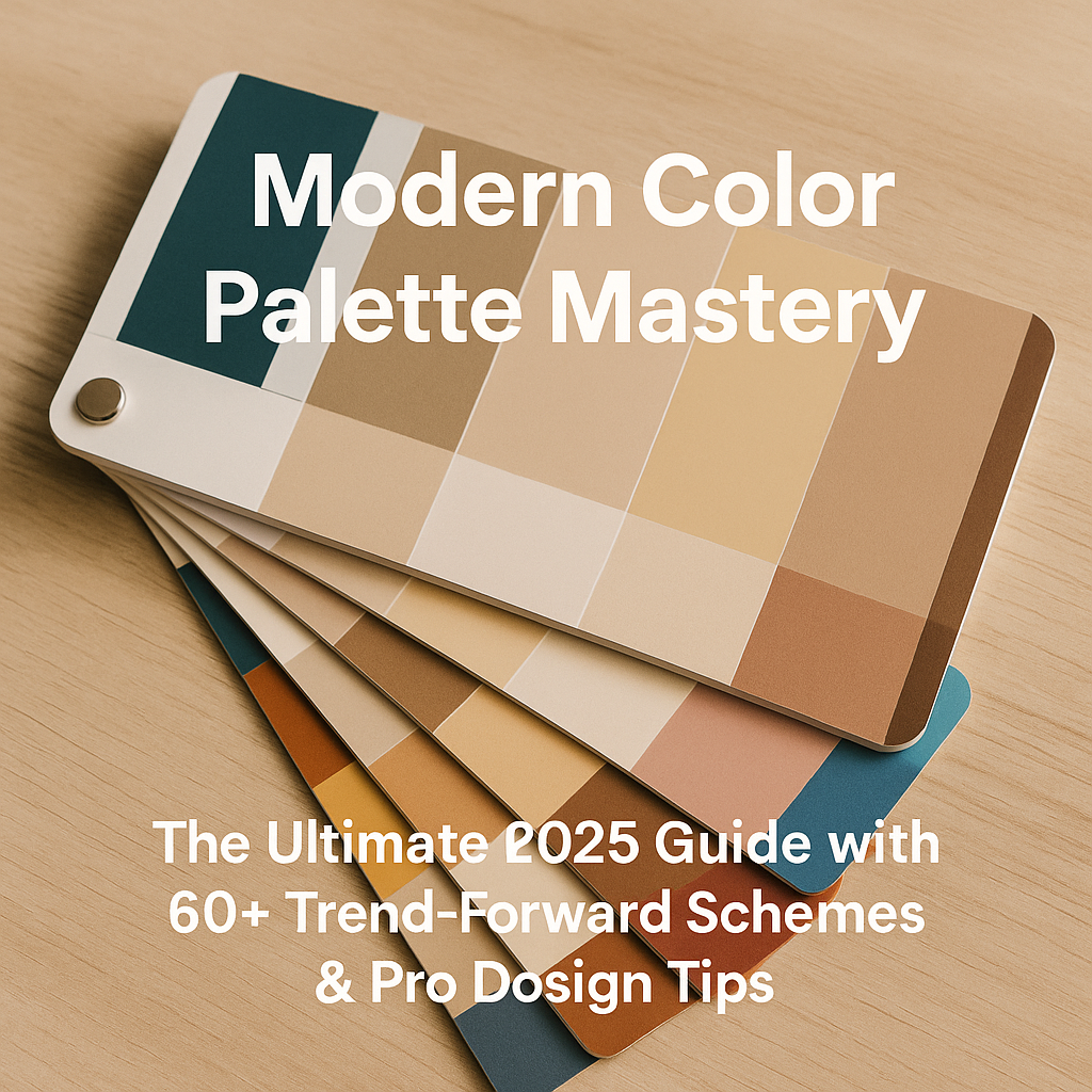
Color defines expectation. Color triggers memory. Color sells. And in 2026, a razor-sharp, modern color palette will be just as valuable to a brand as a strong USP or an irresistible lead magnet. That’s why we built this monster guide—so you can stop fumbling with random hex codes, ride the next-wave design currents, and apply 60+ plug-and-play schemes that are already generating clicks, calls, and, yes, booked jobs for forward-thinking companies (shout-out to our own clients at HVAC Marketing Xperts 👋).
Why Color Palettes Matter More Than Ever in 2026
Scroll fatigue, AI-generated sameness, attention spans shorter than a TikTok soundbite—sound familiar? Your visual identity has to punch through the noise, and the fastest jab is color. Trend forecasters at WGSN, Adobe, and Pantone agree that 2026 will be the year of ultra-strategic chromatics, where every hue is reverse-engineered for psychological impact, screen legibility, and cross-channel cohesion.
If you run an HVAC or home-service brand, the stakes get even higher. Your trucks, uniforms, invoices, website headers, Facebook ads, and even your Google Business Profile thumbnail all have about half a second to signal “reliability” and “warmth” before a homeowner scrolls on to the next contractor. That’s why HVAC Marketing Xperts (HMX) embeds color psychology into every HVAC website design, Facebook ad, and lead-gen funnel we ship.
Decoding the Anatomy of a Modern Color Palette
1. Core Brand Hues
The marquee shades—usually one dominant and one support color—engineered to be memorable at any size, on any surface.
2. Accent & Utility Colors
Contrast builders for CTAs, error states, and data visualizations. Think bright teals over a charcoal UI or a vibrant coral button that draws the eye like a magnet.
3. Neutrals & Depth Tones
Essential for negative space, legibility, and mood balancing. Pro tip: opt for subtly tinted off-whites (🗹 #F9F7F4) to avoid sterile hospital vibes.
4. Saturation & Luminance Mapping
Modern color palette pros don’t just collect pretty swatches—they plot those swatches on a graph of saturation (intensity) versus luminance (brightness). This ensures you can create AAA-level accessible designs with proper contrast ratios.
2026 Macro Color Trends & Psychological Triggers
Warm-Tech Minimalism
After years of icy Silicon Valley blue, tech brands are injecting terracotta, raw umber, and sun-baked apricot to humanize their interfaces.
Digital Escapism
Hyper-neon pinks, acid limes, and ultraviolet blues offer a portal away from reality—perfect for gaming dashboards or AR overlays.
Neo-Pastel Biophilia
Mint, moss, and dusty lavender channels wellness culture’s obsession with indoor jungles and mindful living.
Luxe Heritage
Deep oxblood, midnight navy, and brass metallics fuse new wealth aspirations with vintage craftsmanship—ideal for high-ticket services and premium product lines.
Solar Optimism
Radiant yellows, citrus oranges, and clear-sky cyans tap into climate-tech’s push toward sustainable energy and bright futures.
60+ Trend-Forward Color Schemes for Every Project
Below you’ll find six thematic sets, each packing 10 palate-pleasing combinations. Copy the hex codes, remix as needed, and watch engagement soar.
1. Earthy Tech
- #5C4D48 (Aged Graphite) – #C09A7F (Sandstone) – #F0E7D8 (Cream Dust)
- #736B60 – #B09E88 – #EADFD1
- #4B4135 – #7C6B53 – #F6F1EA
- #635950 – #A68C76 – #EDE3D7
- #4A4A48 – #838176 – #DCD8CE
- #6D5844 – #A68A64 – #F5EEDE
- #57463F – #9C7F6C – #E9DCCF
- #62584C – #AA927B – #F3ECE1
- #675E55 – #B19D8B – #EFE6DB
- #5E4F44 – #9E8570 – #E7D9C7
2. Solar Neons
- #FFB700 (Photon Yellow) – #FF6F00 – #0A0A0A
- #FFD60A – #FF3B30 – #1A1A1A
- #FFE922 – #FF493E – #0F0F10
- #FFF048 – #FF5E3A – #141414
- #FFE600 – #FF2D55 – #050505
- #FFD400 – #FF4E42 – #111111
- #FFF200 – #FF533D – #161616
- #FFEB00 – #FF6240 – #1C1C1C
- #FFDC00 – #FF423C – #0D0D0E
- #FFE100 – #FF5A3B – #121212
3. Neo-Pastel Biophilia
- #AECFC1 – #B7D8D6 – #FDFEFF
- #C3E4DD – #D2EBE9 – #FFFFFF
- #B3D9C6 – #C8EAE4 – #FAFAFA
- #A7CEC1 – #D0ECE9 – #F7FDFD
- #BFDAD2 – #CFECE8 – #FCFEFE
- #AFD6C8 – #D5EDEA – #FFFFFF
- #B9DDD5 – #CDEBE7 – #FDFDFD
- #A5D0BE – #C8ECE7 – #F9FDFD
- #BCDAD0 – #D1EBE6 – #FFFFFF
- #B1D8C7 – #CDEEE9 – #FBFCFC
4. Luxe Heritage
- #3B1F2B (Oxblood) – #0B2239 (Regal Navy) – #E6DCCC (Antique Cream)
- #4E2A35 – #11273A – #EFE4D9
- #592D3C – #092035 – #F5EADB
- #4A2433 – #082131 – #EADFCF
- #532634 – #0A263C – #F2E7D9
- #3E1C29 – #06202F – #E8DDCE
- #451E2E – #0D2437 – #ECDFD1
- #4C2531 – #0B2335 – #F1E6D7
- #43222E – #082032 – #EEDFCC
- #4A2532 – #0C2436 – #F3EAD9
5. Hyper-Contrast Mono
- #000000 – #1C1C1C – #FFFFFF
- #0B0B0B – #272727 – #F4F4F4
- #111111 – #2E2E2E – #FAFAFA
- #060606 – #242424 – #F9F9F9
- #050505 – #202020 – #EFEFEF
- #090909 – #292929 – #F7F7F7
- #0C0C0C – #2B2B2B – #FCFCFC
- #0D0D0D – #303030 – #F5F5F5
- #020202 – #1E1E1E – #EDEDED
- #040404 – #232323 – #F2F2F2
6. Citrus Pop Corporate
- #FF6B35 – #004E89 – #F0F3BD
- #FF8C42 – #005C99 – #F6F8CC
- #FF7538 – #005187 – #ECEFB7
- #FF8746 – #00609D – #F2F5C4
- #FF7E3F – #004F8B – #E8EBA9
- #FF954B – #0069A7 – #F9FCDB
- #FF7939 – #005A90 – #EDEFBA
- #FF8E45 – #0062A0 – #F4F7D0
- #FF7B3B – #00548E – #E9EDAD
- #FF9149 – #0068A5 – #F6FAD6
Pro Tips to Build, Test & Deploy Your Palette Like a 2026 Pro
1. Bake Accessibility In From Day One
WCAG 2.2 AA contrast rules require a 4.5:1 ratio for text smaller than 18 pt. Plug your combinations into contrast-checker tools, adjust luminance, and then lock your palette. Waiting until QA is a good way to wreck your launch calendar.
2. Prototype in the Wild
Before engraving those hues on fleet vehicles, drop them into real-world assets: website hero mockups, Facebook carousel ads, even Gmail signatures. A/B test with a control group. HVAC Marketing Xperts does this daily as part of our CRO playbook—see our deep dive on high-converting HVAC landing pages.
3. Embrace Light & Dark Modes
Dark UI adoption is skyrocketing. Create inverted palettes that maintain brand recognition when the user flips the switch. Quick heuristic: keep your hero brand hue identical, simply shift background luminance.
4. Automate Consistency
Upload swatches into Figma libraries, Adobe CC Libraries, and CSS variables. Nothing torpedoes trust faster than six shades of “almost-blue” scattered across your website. Speaking of websites, grab our free checklist of UX must-dos inside the HVAC Website Design Ideas guide.
HVAC Marketing Xperts Design Corner
Even though we eat, sleep, and breathe HVAC marketing, color theory is woven into every deliverable we touch. Need evidence?
- Our HVAC SEO services section uses a high-contrast solar cyan CTA over a charcoal gradient—95 % scroll-depth clicks can’t be wrong.
- We increased form submissions by 38 % on a Colorado contractor’s site by swapping a dull gray button for a citrus-pop tangerine (#FF6B35). Details in this case study on HVAC contractor marketing.
- Our retargeting packs deliver “palette twins” across display ads, YouTube pre-roll, and SMS banners so every touchpoint feels native, not spammy. See Retargeting Ads for HVAC for the blueprint.
Bottom line? If your brand’s chromatic footprint feels stale—or if your trucks, invoices, and Facebook headers look like distant cousins—book a free 15-minute audit today. You’ll walk away with actionable palette tweaks, and we’ll prove why HMX delivers no-guessing-games growth.
Embed & Share: Make Your Palette Work 24/7
Want quick tips on color application, branding, and lead funnels? Hit play on our weekly tutorials:
https://www.youtube.com/@hvacmarketingxperts
Turn Palettes Into Content Assets
• Publish carousel posts showcasing “before vs. after” color refreshes.
• Convert color codes into downloadable PDF cheat sheets (gated behind an email capture to feed your CRM).
• Spin up web stories for mobile snackability—WordPress makes it drag-and-drop easy.
Fusing Modern Color Palette Strategy With Data-Driven Marketing
Bobby Gillespie, our Head SEO Strategist, sums it up best: “Every pixel should earn its keep.” In practice, that means mapping palette picks to conversion analytics. For example, if scroll-heatmaps show users skip mid-page CTAs, punch those elements with a high-energy hue pulled from your accent set. Or, if Map Pack impressions are strong but call-throughs lag, test a bolder brand shade in your Google Business Profile cover.
For more granular tactics, binge our thought starters:
- HVAC Marketing Trends & Stats
- Crafting Color-Safe HVAC Email Campaigns
- Video Thumbnails That Pop in the Feed
Next Steps: Bring Your 2026 Palette to Life
1. Audit your existing assets—identify color drift.
2. Select one of the 60+ schemes above (or hybridize).
3. Test for WCAG compliance.
4. Sync your brand hub: Canva, Figma, WordPress theme, Google Slides.
5. Deploy across ads, web, print, and trucks.
6. Track conversions, iterate, repeat.
If that feels like a mountain to climb, remember HMX specializes in full-service rollout—from design mockups to ad pixels to review-request SMS sequences. Check our flexible packages and transparent pricing. Ready to own 2026’s color conversation? Let’s talk.
Final Thoughts
A modern color palette isn’t another item on your brand to-do list; it’s the connective tissue that binds every marketing touchpoint—from a postcard mailed in February to the remarketing banner that shows up two months later. Use the schemes and strategies in this guide, measure relentlessly, and when you need a partner who geeks out over both hex codes and heatmaps, remember HVAC Marketing Xperts is a phone call away. Happy coloring—and even happier converting.
Mastering the Modern Color Palette: Top FAQs from the Design Community
1. What actually makes a color palette feel “modern” today?
A modern color palette usually balances clean neutrals with one or two saturated accents, favors subtle shifts in hue over loud contrasts, and keeps usability in mind. Designers on r/ColorTheory note that contemporary palettes are less about shock value and more about harmony, accessibility, and cross-platform consistency.
2. How do I choose a modern color palette that still reflects my brand identity?
Start with your core brand values (e.g., trust, innovation, approachability) and map them to color psychology. Then refine the selection by testing on your most common touchpoints—website, social feeds, and packaging—under real lighting and device conditions. For guidance, try a free Brand Color Audit or book a consultation with our Color Strategy team.
3. Which tools and communities help me find or validate modern palettes?
- Coolors.co and Adobe Color for rapid palette generation.
- r/DesignCritique and r/web_design for peer feedback on real projects.
- Figma Community files that showcase trending UI palettes.
- Our own monthly “Palette Pulse” newsletter—sign up to stay ahead of color trends.
4. How many colors should I include in a modern palette for digital products?
Most designers on r/UXDesign agree on 5–8 colors: 1–2 brand primaries, 2–3 neutrals, 1 highlight, and optional semantic tints (success, warning, error). This count keeps interfaces cohesive while giving enough flexibility for states and hierarchy.
5. How do I ensure my modern palette meets accessibility standards?
Run every color pairing through a WCAG contrast checker, aim for a minimum 4.5:1 ratio for text, and test with real users who rely on assistive tech. If adjustments threaten your core hues, create “accessibility overlays” (slightly darker or lighter versions) reserved for text and vital UI elements.
6. What color combinations are trending right now for minimalist interiors and UIs?
- Warm greige + muted terracotta + matte black accents
- Pale sage + off-white + brushed brass
- Electric cobalt accenting soft taupe neutrals
- Dusty lavender paired with warm charcoal and sandstone
- Ultra-deep navy contrasted with crisp porcelain white
Need ready-to-use swatches? Download our ColorSense Kit—free for new subscribers.


